How to Layer Accessories Like a Pro
If you’ve ever flipped through a home magazine and wondered why the rooms in the photographs look so gorgeous and polished, the answer is layering. If you pay attention, you’ll notice that there’s a balance and symmetry to how accessories and art are positioned. There are a few rules that can help you create that finished look in your own home. Here are some of my favorites:
Kara Cox Interiors
Mix It Up
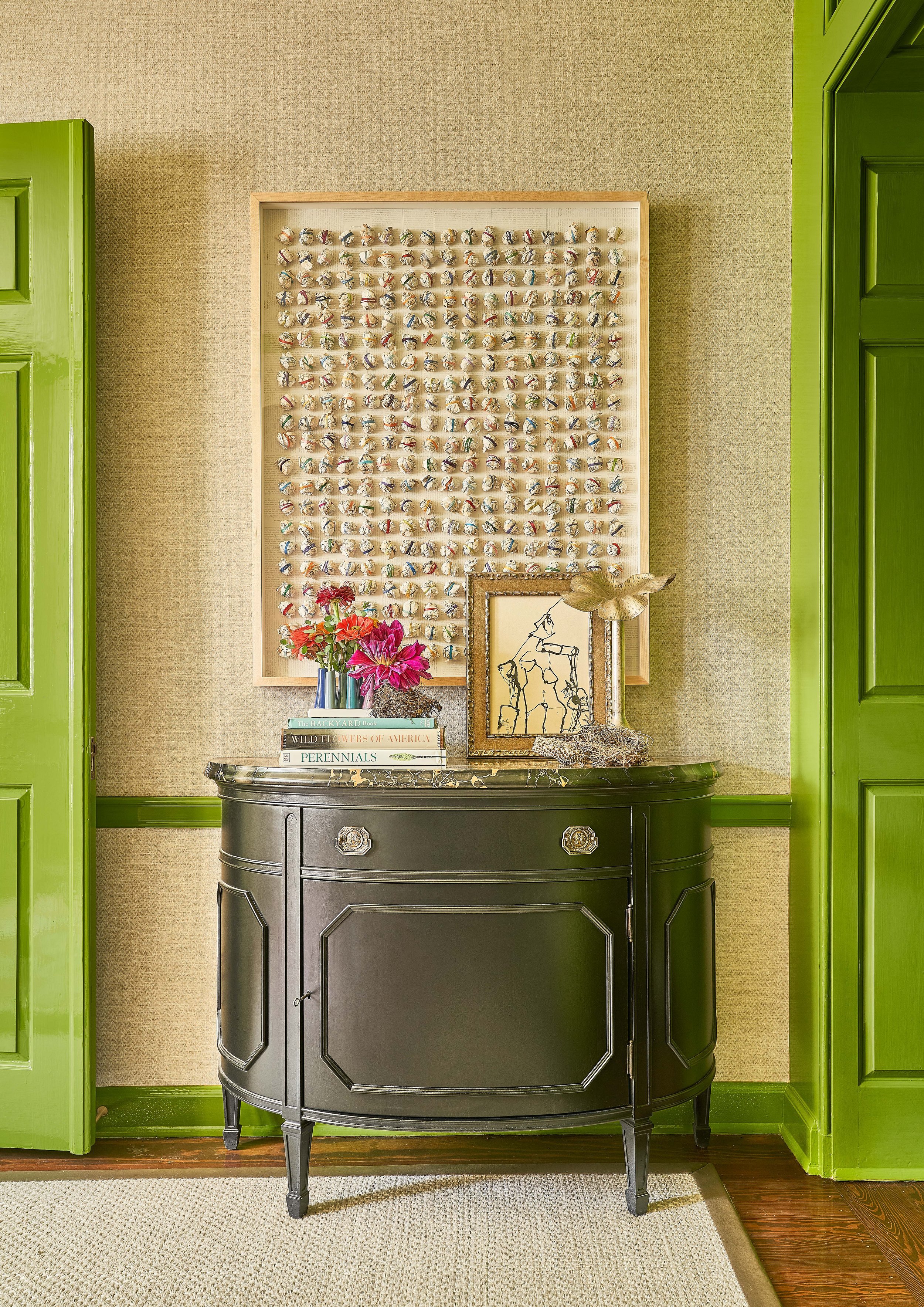
As you start bringing your art and accessories into a room, think about a mix of materials and textures. In the vignette above, I used a tactile piece of modern art, a modern sketch, a grouping of small vases, books, and even birds nests that my client collected. Each of those materials adds texture and visual interest - they make you want to get closer to investigate each piece. And they tell the story of who my client is and what she loves.
Kara Cox Interiors
Balance and Space
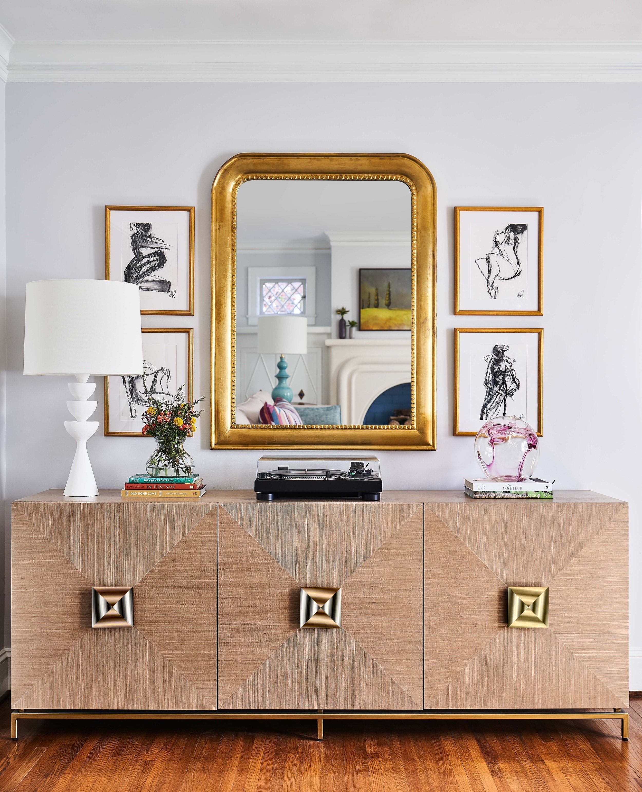
Balance and symmetry are so important in interior design. Your eye can tell - even if it’s subconsciously - when something is off in a room. Your brain is hardwired to appreciate symmetry and that’s why you know when it’s missing. In the room above, there is a clear center point created by that middle door on the buffet. So the idea was to use that as the place I would build from. The mirror and the record player are centered on the door, then the art, lamp, and accessories are carefully balanced on either side of those center pieces. But another important factor is space. There is enough negative space in this vignette so the eye can travel around the things on display without feeling distracted or overwhelmed.
Kara Cox Interiors
Group Similar Pieces
When you have a collection of small pieces, scattering them around a room can keep them from being noticed. It can also make the room feel cluttered. I like to group similar pieces to make a bigger impact. On the mantel in my client’s living room above, I pulled together her collection of vintage brass objets. It makes a much more cohesive look, especially when paired with an ornate mirror that’s in the same color family.
Kara Cox Interiors
Vary the Heights
If everything on the cabinet above was the exact same height, it would create a boring line and wouldn’t allow your eye to travel. Using items at different heights gives the look a visual interest that’s much more pleasing. And notice that there’s a great throughline with the brass hardware on the cabinet, brass on the lamp, and then on the small fish accessory. That helps to pull it all together.
Kara Cox Interiors
Lean Into It
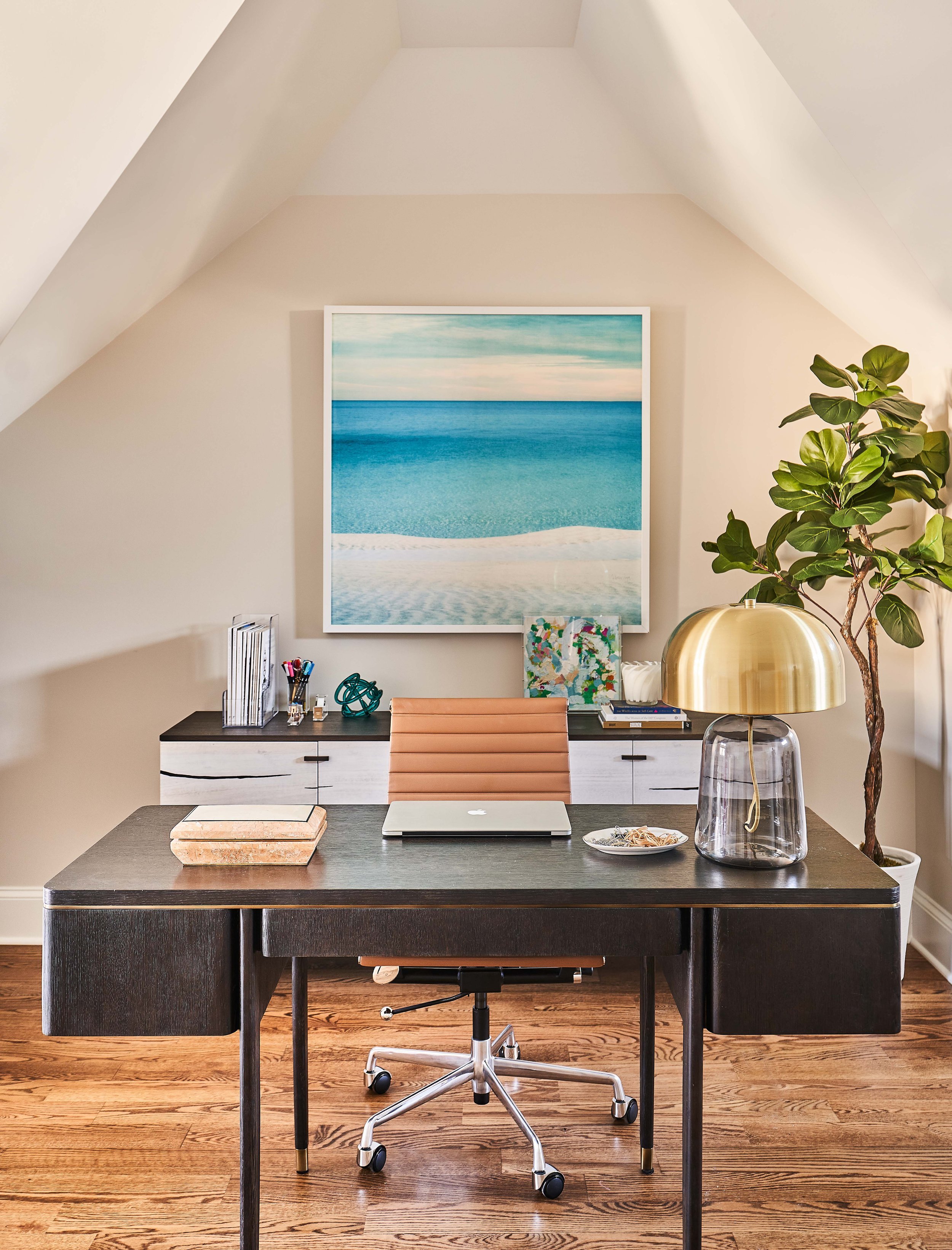
Layering items in front of each other is also another way to keep things interesting. Don’t be afraid to lean one piece of art against another, like I did in my client’s home office above. This works especially well when the two pieces of art have a similar color story.
Try these ideas to create a gorgeously layered look in your rooms. And if you need help with a renovation, furnishings package, or a new build, give my team a call!
All the best,
Kara


